Mistakes with heading tags impact search results and accessibility
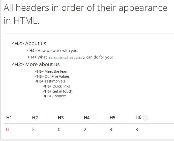
One of the most common – and most obvious – mistakes I see on websites are related to headings. Website pages might have too many or too few headings. They might be stuffed with keywords or have no keywords. But all of that is somewhat eclipsed by how these headings are actually tagged: H1, H2, H3, etc. The example above covers a multitude of sins, including no H1 – read on for more…
How you tag your headings is really important. It matters to the search engines, for AI search, and for accessibility. Headings are a vital part of the page structure – and give the average reader visual cues to the content too.
Heading tags are not a design choice
Heading tags and how you apply them – H1 all the way down to H6 – have nothing to do with look or font size. Most website designs will have a decreasing font size assigned to each heading, so H1 will be the largest, H6 the smallest. Some will have a different font or colour differentiating them too (which are design choices).
This is based on the idea that, essentially, different font sizes, etc, are a visual representation of the ‘importance’ of a heading and indicate how much relevance a heading has on the page. They could technically all be the same size, or the H1 be the smallest – but that wouldn’t help visually and would fail accessibility tests.
On some websites you’ll see headings haven’t even been tagged. Normal paragraph text has been made to look like headings through font size, use of bold, etc. Visually they work, but they do nothing beyond that. They don’t help the search engines or screen readers.
Heading tags are for search engines and accessibility
Heading tags are one of the main elements telling search engines how to read and categorise your page. They are also one of the most important navigation tools used by screen readers. Screen readers don’t just read from top to bottom, they need to understand how a page is structured so they can jump around as necessary.
Heading tags shouldn’t be assigned based on what ‘looks good’
Many designers, designs, and platforms use headings with set font sizes and/or types that can still be changed manually. Others have set font sizes or styles that are completely set and can’t be changed.
Because heading tags tell the search engines and screen readers what the most important information is, if you tag your headings incorrectly, you have a problem. H1 and H2 should provide the key information.
So, if headings are tagged wrongly, the search engines are not understanding the right things, which means they index the pages incorrectly (if at all) and they don’t appear in the right/any searches. Anyone using a screen reader will be getting the information in the wrong order too.
The all-important H1: what you need to know
This is the key heading and should include your keywords as well as represent what’s on the page. It’s what the search engines look at first.
- There should only ever be one H1
- There should always be one H1
- The H1 should always be the first heading on the page
Heading hierarchy and how you use it
- The H1 should always be the first heading on the page.
- Don’t skip a level: for example, after the H1 you can use an H2, you can’t skip to an H3 or an H4. After an H2 you can’t skip to an H4.
- Each section has its own hierarchy: for example, you can use an H3 under an H2 but only if it makes a point related to the H2. You should only use an H4 under an H3, never immediately after an H2, for example.
- Most pages would never go below an H4.
The key takeaway here is that there’s a hierarchy for each section you’re writing. When you go back to your main point or start a new one, you start again:
An example of how not to do headings:
This is a visual representation of a website page and its headings and how they are tagged
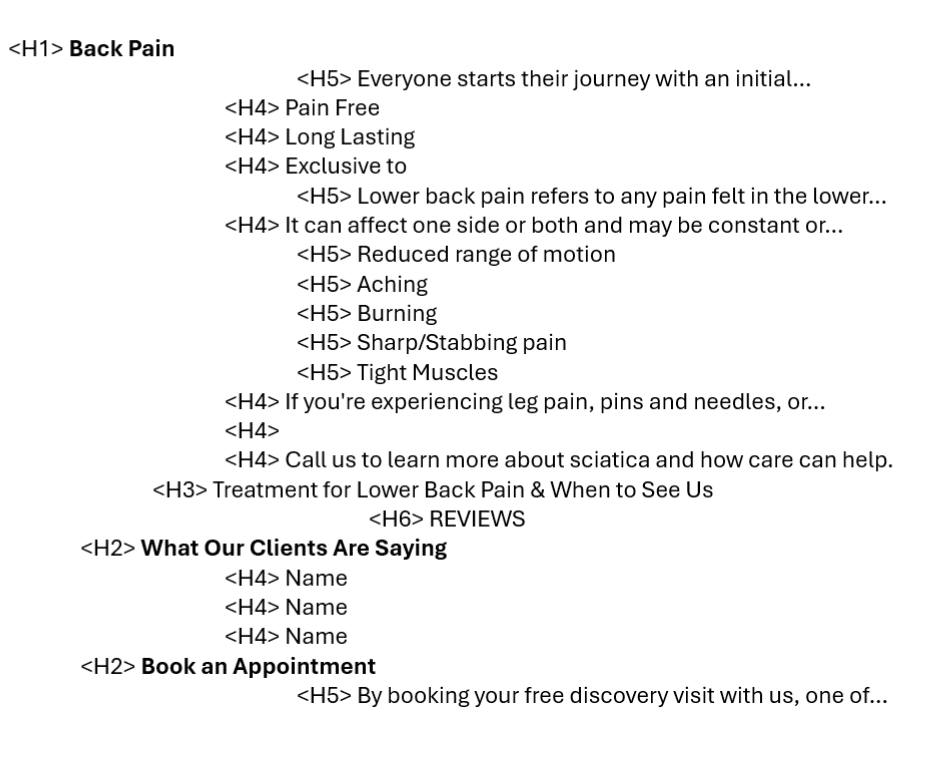
There’s an H1, but it then skips straight to an H5 (which was a whole paragraph of text that I’ve shortened). Every heading is chosen for how it looks on the page. Screen readers and search engines see the H1, ‘Back pain’, and the two H2s ‘What our clients are saying’ and ‘book an appointment’ and consider them the key information here.
These headings don’t mean much on their own and are applied where they shouldn’t be, eg for reviewers’ names (which I’ve removed for privacy). Some headings are empty (for spacing, perhaps), and several are paragraphs (where I’ve replaced the text with …) that the designer has decided deserve a larger font and made them headings to achieve this.
A better example of how to do headings:
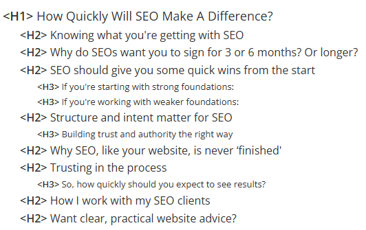
The headings give you a good idea of what’s on the page and you can clearly see sections and how the subheadings (H3) relate to the main section headings (H2). You, the search engines, and screen readers should have a good idea of the content. You can decide immediately whether it’s going to be useful. The search engines should know how to index it and screen readers will understand the layout properly. You can read the rest of this blog How Quickly Will SEO Make A Difference?’ I’ve taken it from if it sounds interesting.
What if you don’t like how your headings look?
Most designs will let you change the font, font size, or other attributes of a heading, even if they have a default setting. However, bespoke or other designs that lock these settings can be overridden with custom CSS (you’ll probably need to ask your designer). If they absolutely can’t be changed, stick to the heading hierarchy rules regardless of your feelings about how it looks.
What this all means for website copywriting
Anyone writing copy for online consumption needs to understand and apply these rules. A website copywriter should be supplying heading tags with their copy and making sure the headings tell the ‘story’. And if they’re supplying all this information, whoever is inputting it should be paying attention to what’s on the page and following the instructions. If they understand the reasoning behind it too it makes it all a lot easier.
I spend a lot of time explaining this to people, website designers included. It’s an easy mistake to make and it’s also easy to get caught up in the aesthetics even when you know better.
Do you need help with your headings and heading hierarchy? Why not get in touch for a chat? I write SEO copy for websites and provide SEO services too.